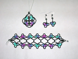
The "Wondrous Window" set, designed by Marilee Rockley, using Marilee's "Stardate" HDT (which has all of my favorite colors in one thread!) and black Lizbeth.
I'm very happy with the way these turned out, particularly the pendant. I was really a bit nervous about the pendant. This is the woven beaded picot variation, and I wasn't sure it would come out right. You see, the pattern calls for size 10 seed beads and size 20 thread, and as Marilee says, proportion is very important in this pattern. Well, what I had available was size 11 beads, size 30 HDT, and size 40 Lizbeth. (I do have size 20 black Lizbeth as well, but since I had to choose, I decided the black thread should be smaller than the colored thread. For some reason, I have no size 30 black of any kind in my stash.) It came out just fine, though.
There were a couple of teensy things I did differently. At the beginning of each outer chain, I joined to the base of the previous outer chain. That way, there is no visible break between the two chains; it looks like the outline is drawn, as it were, without picking the pencil up. Otherwise you would see the division between the outer chains where I stopped to chain around the trefoil. Also, I made that floating ring at the top as a loop-tatted ring so that I didn't have to use a second shuttle.
On the bracelet, the thread size made a real difference. Marilee's bracelet only has five trefoils along each side, while mine needed seven to achieve the same length.
For the inner chains of the bracelet, I also joined to the base of the previous inner chain, for the same reason. I also started differently. The pattern tells you to start at the black clover at one end. However, when I'm working in two colors I prefer to end at a spot where both colors come together. This way I can hide each end in the matching color; if I don't it sometimes shows a little bit. Therefore I started at one of the trefoils instead.
I took a slightly different approach to the earrings. Instead of keeping the HDT as the core thread on the chains, I hid both ends in the rings and started fresh using continuous thread method for the black parts. No particular reason, it just worked for me. After making the chains all the way around, I cut off the ball thread with a long tail. Just like Marilee's instructions, I used this tail to finger tat the second half of the split ring. I converted the top ring to a single shuttle split ring in order to hide the ends.
None of this is any better than how Marilee wrote the pattern. It's just a different way of doing it, with the same result.
I love the stained glass look of this set, and I think that you really need to use a hand-dyed thread to get the full effect. The way the colors blend together in an HDT gives it a character that commercially dyed threads can never achieve.
I was also interested in the different variations of the pendant. There's the basic version with no beads and no decorative picots, just smooth, clean lines. This looks very elegant with the black outline. Then there's a version with lots of decorative picots. To be honest, I didn't think the picots went as well with the stained glass look; glass is smooth, not frilly. But I could envision the picot-y version in soft pastels, using the same thread for both rings and chains.
This is the pendant with lots of picots in Krystledawn's "Fairy Faint" HDT, with just a few white beads added. It hardly looks like the same pattern, does it?


Gorgeous!!! is all I can say! I love that! I want to get that book! :)
ReplyDeleteMiranda es un conjunto hermoso. El efecto vitral se ve lindo con el negro y muy brillantes colores. Felicidades
ReplyDeleteNicely done, Miranda! These all look so good. First I noticed was the way those black beads work in the centre of the pendant. Are they rectangular? Japanese beads? They look great.
ReplyDeleteStrangely enough, I LOVE the lilac pendant. Usually I am not so fond of frills if there is a plainer choice, but in this case, I think I like the many picots with the beads more than the stained glass look alike! It is really pretty.
Fox : )
Lovely jewellery, I love the Lilac pendant, I usually dont like black but your stained glass looks beautiful.
ReplyDeleteMargaret
Beautiful. The black really makes the colors pop.
ReplyDeleteElizabeth
very nice. I like the look of the stained glass, but also like the look of the lilac pendant as well. interesting.
ReplyDeleteAmazing the difference a change of colour makes! I love the stained glass look, and I love Yarnplayer's 'stardate'! Lovely tatting!
ReplyDelete